How to Choose the Best LED Spotlights for Your Needs
Choosing the right Led Spotlights starts with the space, not the product photo. A narrow beam can highlight a framed print, but it may leave a kitchen counter unevenly lit. A wider beam can soften that contrast. Small choices matter.
Lighting designer and engineer James R. Benya’s guidance can be paraphrased this way: “Match the beam to the task before judging the fixture’s appearance.” That is a useful starting point, not a complete specification. Consider what you need to illuminate, how far the light sits from the surface, and whether people will see the source directly. Then compare beam angle, brightness, color temperature, color rendering, and dimming compatibility. Check the manufacturer’s technical data, too. A warm 2700K tone may feel comfortable in a living room, while a work area may benefit from a clearer, brighter appearance. Context decides.
Details count. A spotlight aimed at a glossy countertop can create glare; a fixture with poor color rendering may make carefully chosen paint look dull. Not every room needs the same solution. Measure the ceiling height, note nearby windows, and test one fixture before ordering a full set when possible. Check the fixture’s rated life and heat-management information, rather than relying on headline wattage alone. Wattage indicates power use, not perceived brightness.
There is no perfect shortlist. A well-reviewed spotlight can still disappoint when its beam misses the target or its dimmer flickers. The sections ahead explain how to compare these specifications, match fixtures to rooms, and avoid common buying mistakes. Use them as a practical guide, then verify the details for your own space.
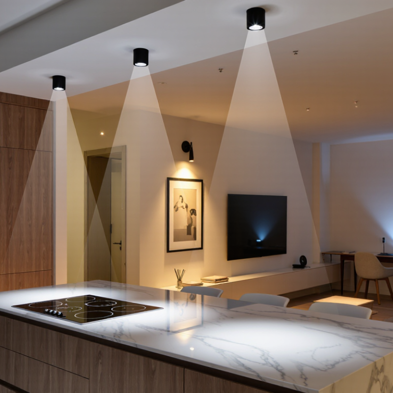
Define the Lighting Task and Set Target Illuminance Using IES Guidance
Choose an LED spotlight only after defining what it must illuminate. A kitchen counter, a painting, and a warehouse aisle need different beam shapes and light levels. Note the task, the target area, and the surface where light should land. Measure illuminance in lux on that task plane, not at the ceiling. Measure the task plane.
Use the relevant IES guidance for the space and activity to set a target illuminance. Recommended levels depend on factors such as task detail, contrast, and ambient light. Treat the guidance as a starting point, not a fixed answer for every room. A spotlight’s lumen output alone cannot tell you whether the target will receive enough light; beam angle, mounting height, and distance matter too. I have seen plans look convincing on paper, then leave a dark strip between beams. That is worth checking before installation. Consider glare and shadows as well, especially near glossy counters or screens.
Tips: Sketch the target area and mark the mounting height. Check the fixture’s beam spread, then estimate overlap between spots. After installation, take a lux reading at the actual work surface. Adjust the aim if the edges are dim or the beam feels harsh.
Select Color Quality: 2700–5000 K CCT and CRI 90+ for Accurate Color
Color quality changes how a room feels and how reliably you see surfaces. A 2700 K spotlight casts a warm, candlelike tone that suits bedrooms and wood finishes. Around 3000 K still feels warm, but can look less amber on pale walls. For kitchens, studios, or work areas, 3500–4000 K often gives a more neutral appearance. At 5000 K, light looks cooler and can make white surfaces seem crisp. Cooler is not automatically clearer.
Check the stated color rendering index, or CRI, alongside color temperature. CRI 90+ generally helps reveal subtle differences in skin, paint, food, and fabric. Still, CRI is an average, so it may not tell the whole story for deep reds. If red objects matter, look for an R9 value in the product data. Compare a sample against your actual flooring and wall colors, preferably at the time of day you use the room. A lamp can look balanced in a showroom yet feel harsh beside warm wood at home. Dimming can also shift perceived color, and specifications do not always capture that experience.
How to Choose the Best LED Spotlights for Your Needs - Select Color Quality: 2700–5000 K CCT and CRI 90+ for Accurate Color
| CCT | Typical Appearance | Common Uses | Color Quality Guidance | Selection Notes |
| 2700 K | Warm, amber-leaning white | Living rooms, bedrooms, restaurants, and accent lighting | Choose CRI 90+ when rendering furnishings, artwork, or skin tones accurately is important. | Creates a cozy atmosphere; may make cool whites appear warmer. |
| 3000 K | Warm white, slightly less amber than 2700 K | Kitchens, hallways, hospitality spaces, and general residential lighting | CRI 90+ is a useful target for more faithful colors in frequently used spaces. | A common compromise between a relaxed feel and clear visibility. |
| 3500 K | Soft neutral white | Kitchens, work areas, retail spaces, and mixed-use rooms | For color-critical tasks, look for CRI 90+ and check the product’s detailed color-rendering specifications. | Can balance warm surroundings with task visibility. |
| 4000 K | Neutral white | Garages, offices, utility areas, and task-focused lighting | CRI 90+ can help distinguish colors more reliably for inspection, display, or detailed work. | Often appears less warm than typical residential lighting. |
| 5000 K | Cool, daylight-like white | Workshops, some commercial settings, and areas needing a cooler appearance | A CRI rating of 90+ supports more accurate color appearance, but CRI alone does not describe every aspect of color quality. | Compare samples in the actual room; a cool CCT may feel stark in a warm interior. |
Quick tip: CCT describes the apparent warmth or coolness of white light; CRI is a general measure of how faithfully a light source renders colors compared with a reference. For especially color-sensitive applications, review additional metrics such as R9 and, where available, TM-30 data.
Compare Lumens and Candela Using ANSI/IES LM-79 Photometric Data
When choosing an LED spotlight, compare more than its lumen rating. Lumens describe the total visible light emitted; candela measures intensity in a particular direction. A narrow beam can create a bright pool with fewer lumens, while a wider beam spreads light across more space. For a workbench, beam shape may matter more than a large lumen number.
ANSI/IES LM-79 photometric data gives measured performance under stated test conditions. Look for total luminous flux and, when provided, candela values or an intensity-distribution chart. Check the beam angle, too. Two spotlights with similar lumens can illuminate a wall very differently. Compare reports taken at similar input power and conditions, rather than relying on package claims alone. LM-79 measurements help, but they do not tell you whether the beam suits your room. I still double-check the chart against the actual mounting distance.
Tips: Match peak candela to the distance and area you need to light. Check for glare from your usual viewing position. Small differences matter.
Aiming the fixture can change the result noticeably. For a display shelf, a tight beam may highlight one object but leave nearby items dim. A wider beam may look more even, though less dramatic. Consider both the measured data and the scene you want.
Check Dimming Compatibility and IEC 60529 IP Ratings for the Installation
A spotlight may fit the ceiling perfectly and still perform poorly if its dimmer is incompatible. Check the lamp or driver specifications against the dimmer type, such as trailing-edge or leading-edge, and note any minimum load. A mismatch can cause flickering, buzzing, or a narrow dimming range. Small details matter. Test the lights at low and high settings before finishing the installation, especially if several spotlights share one dimmer. A dimmer that worked with older halogen lamps may not suit LEDs.
For damp or exposed locations, check the IEC 60529 IP rating stated for the exact fitting. Its first digit describes protection against solid particles; the second describes protection against water. IP44 resists splashing water, while IP65 is dust-tight and tested against water jets. That does not make every IP65 spotlight suitable for every location: mounting position and exposure still matter. It is tempting to treat a higher number as automatically better, but that can overlook the fitting’s actual installation limits. For a covered porch, consider wind-driven rain; in a bathroom, check the required rating for the specific position and follow local installation guidance. A label alone is not the whole decision.